Design Snapshots: AI Product Experience Design
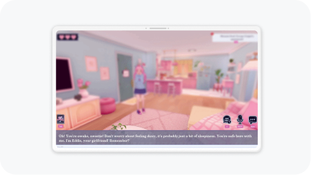
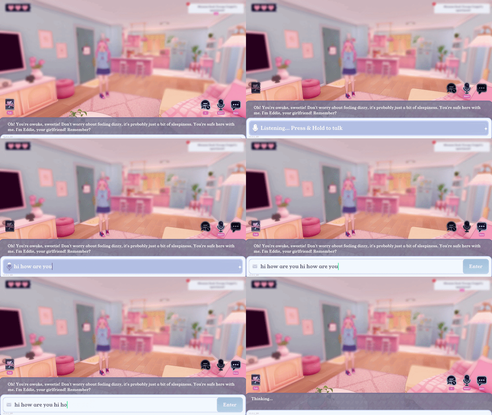
This collection highlights my focus on interaction design in AI2U, an AI-powered companion platform. 2D illustrations and 3D assets are created by dedicated Concept and 3D artists.
Overview
Challenge
Feedback from cross-functional teams and users revealed unresolved usability issues across core screens ahead of V1.0.
Goal
Make core screens easy to understand and navigate, while supporting user needs and business goals for launch.
Impact
Owned interaction design across 50+ screens from pre early access through the V1.0 launch, which shipped with an 88% positive Steam rating across 2,000+ reviews.
Design Snapshots
Post-Session Summary
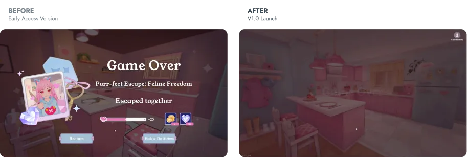
Overview
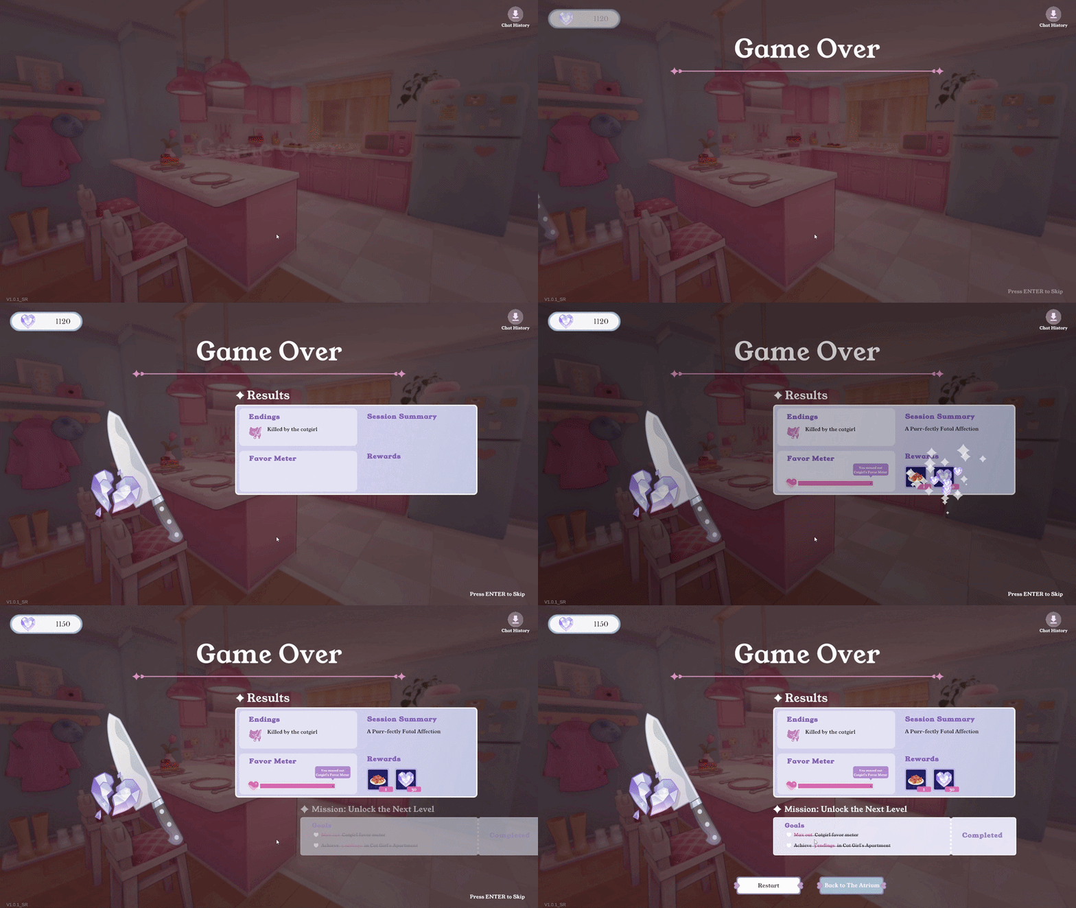
Led the iteration cycle to improve readability and clarity for the post-session summary screen so users could follow the overall experience flow.
Problem
A lack of visual hierarchy left users unable to tell what the session information meant, and the AI generated overview requires processing time the screen had to design around.
UX Approach
- Applied Gestalt grouping and visual hierarchy to organize content into scannable sections
- Sequenced the entrance animation so session stats resolve first, giving the AI overview room to process before it lands
Session Setup & Overview
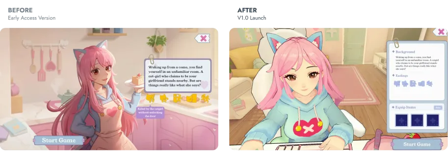
Overview
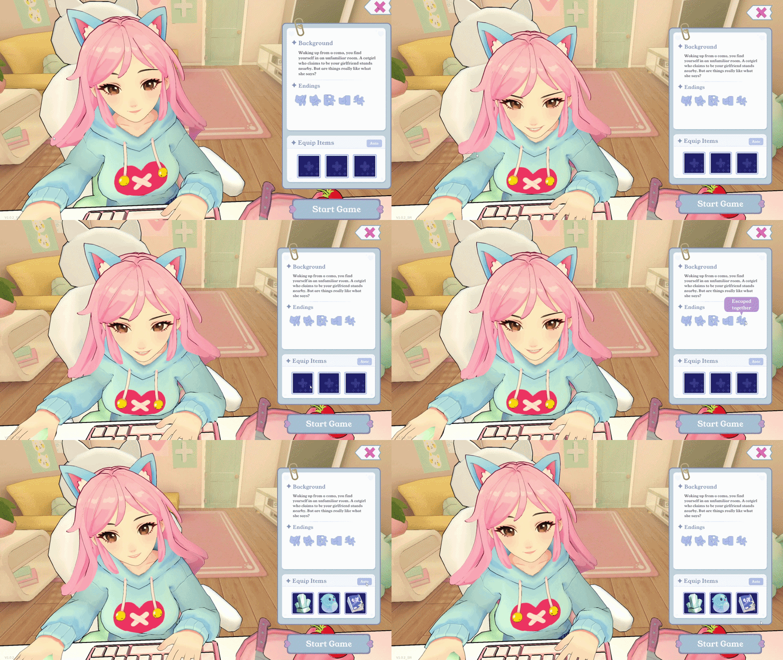
Led the iteration cycle for the level overview screen, a template reused across all five levels, restructured to hold new features without losing scannability.
Problem
The screen presented content without visual hierarchy, and incoming requirements added more information to an undifferentiated layout.
UX Approach
- Established visual hierarchy to organize existing content
- Integrated equip items into the structure
Shop
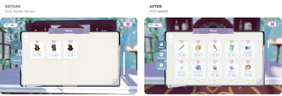
Overview
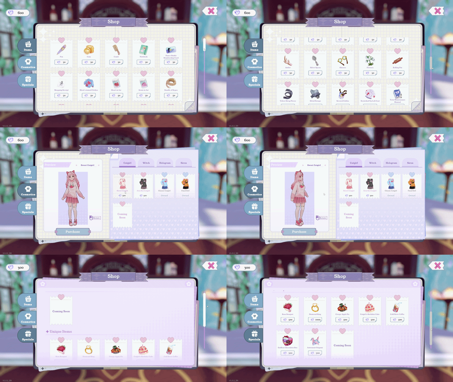
Led the end-to-end iteration cycle for the shop screens, restructuring the interface around conversion goals.
Problem
The interface lacked the merchandising structure needed to support conversion focused business goals.
UX Approach
- Applied the endowment effect through a try on feature, letting users visualize ownership before purchase
- Grouped items by category to support browsing
AI Character Customization
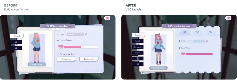
Overview
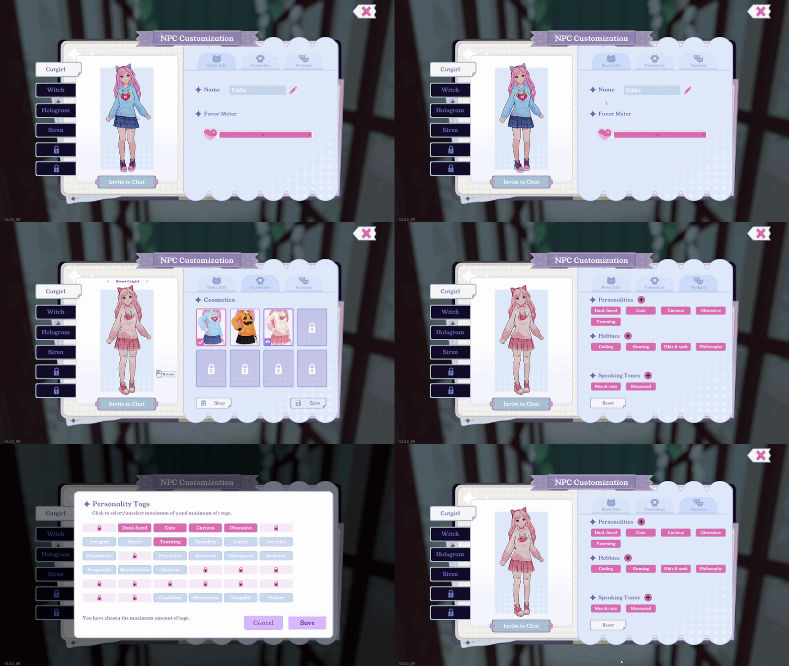
Led the end-to-end design cycle for the customization panel, where users shape their companion's appearance and AI personality traits before a session.
Problem
Inconstent interaction patterns increased the learning curve, and personality settings lived in a separate modal, splitting how the companion looks from how it behaves.
UX Approach
- Applied a consistency heuristic to align interaction patterns with the shop
- Consolidated appearance and personality into one panel so trait changes read against the model in view
In-Session Controls & Guidance
Overview
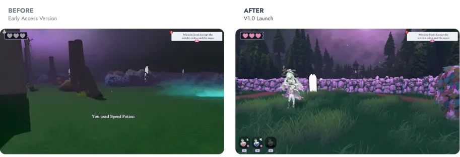
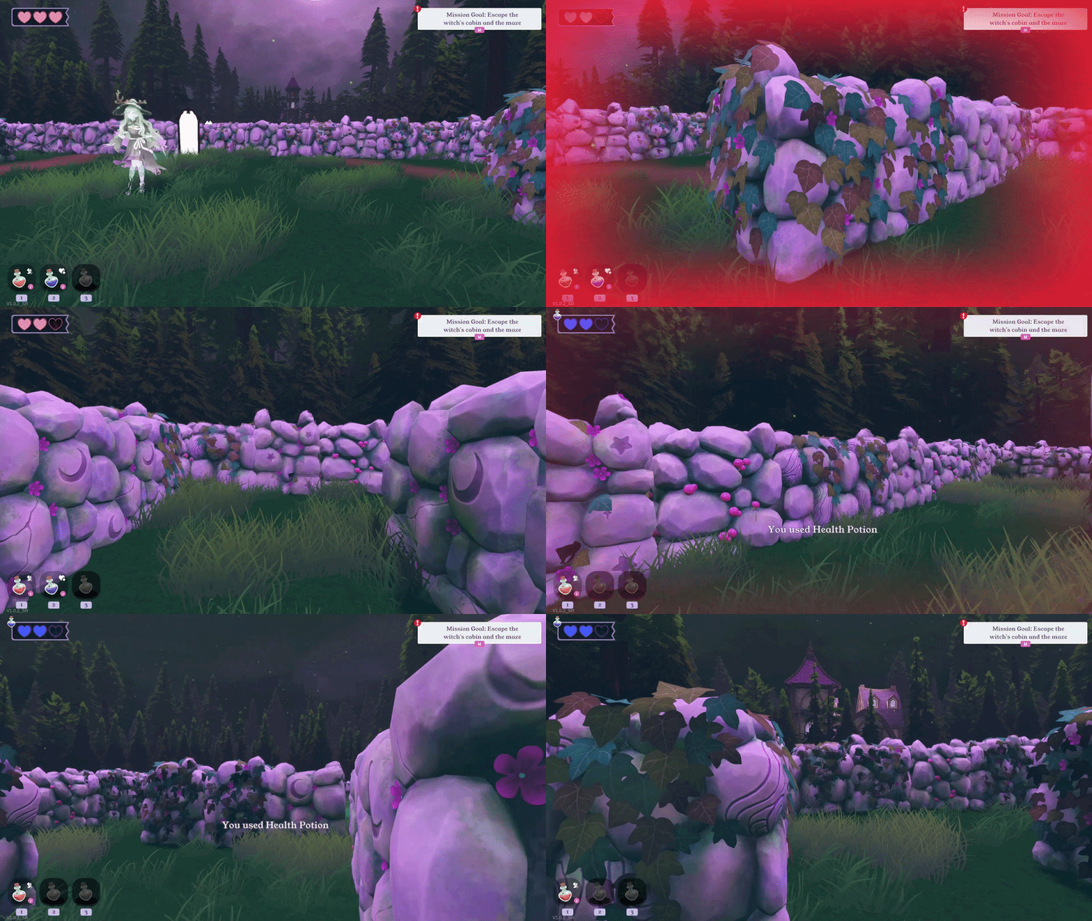
Designed in-session controls and contextual guidance to help users discover available actions without distracting from the 3D environment.
Problem
The in-session UI gave users no signal of what was available, so they did not know what to use in the maze.
UX Approach
- Made available controls and interactive items easier to discover.
- Applied minimalist UI principles to keep visual weight low so the 3D scene stayed primary
Phonograph
Overview
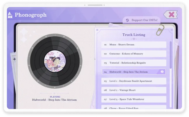
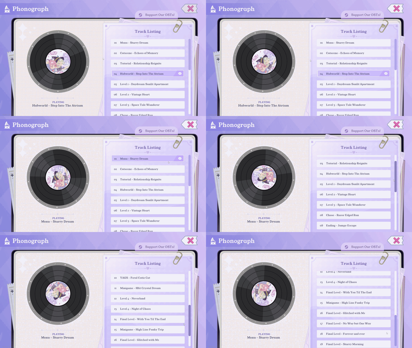
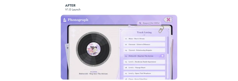
Led the interaction design for the in-app music player from 0 to 1, giving users direct control over ambient audio.
Problem
Album soundtracks lived on Steam, separate from the environment where users wanted to control playback.
UX Approach
- Reused familiar player patterns to reduce learning cost
- Applied the platform's design system for visual consistency
Impact
I owned interaction design across 50+ screens for AI2U, an AI-powered interactive experience, from pre-early access through V1.0. I translated cross-functional requirements into interfaces for AI character customization, commerce, and core user flows.
50+ screens
Designed the interface across core AI interaction, commerce, and system surfaces.
88% positive
Rated by players across 2,000+ Steam reviews at the platform's V1.0 launch.
What I’d learned from these projects

Each team hears a different version of the same screen
Engineering read the shop as data and system behavior. Marketing read the same layout as placement and color. I learned to present one design in two rationales, which got decisions approved in a single review instead of a second round.

I'd negotiate scope earlier
New requests arrived mid cycle with high priority attached, often close to a deadline. I absorbed them into the current sprint. Now I surface the tradeoff at intake, so scope decisions happen before the work starts instead of after.